Project 2
Introduction: For this project, I will use DHS data to create models for predicting wealth in Ethiopia based on age, gender, education level, household size. This DHS data is Ethiopia’s household recode from the year 2016, and it is a Standard DHS-VII survey. I will create a penalized logistic regression model, a random forest model, a linear estimation model using the tensorflow estimator API, and a gradient boosting model using decision trees. I will analyze each model and choose the best model overall using area under the ROC curves.
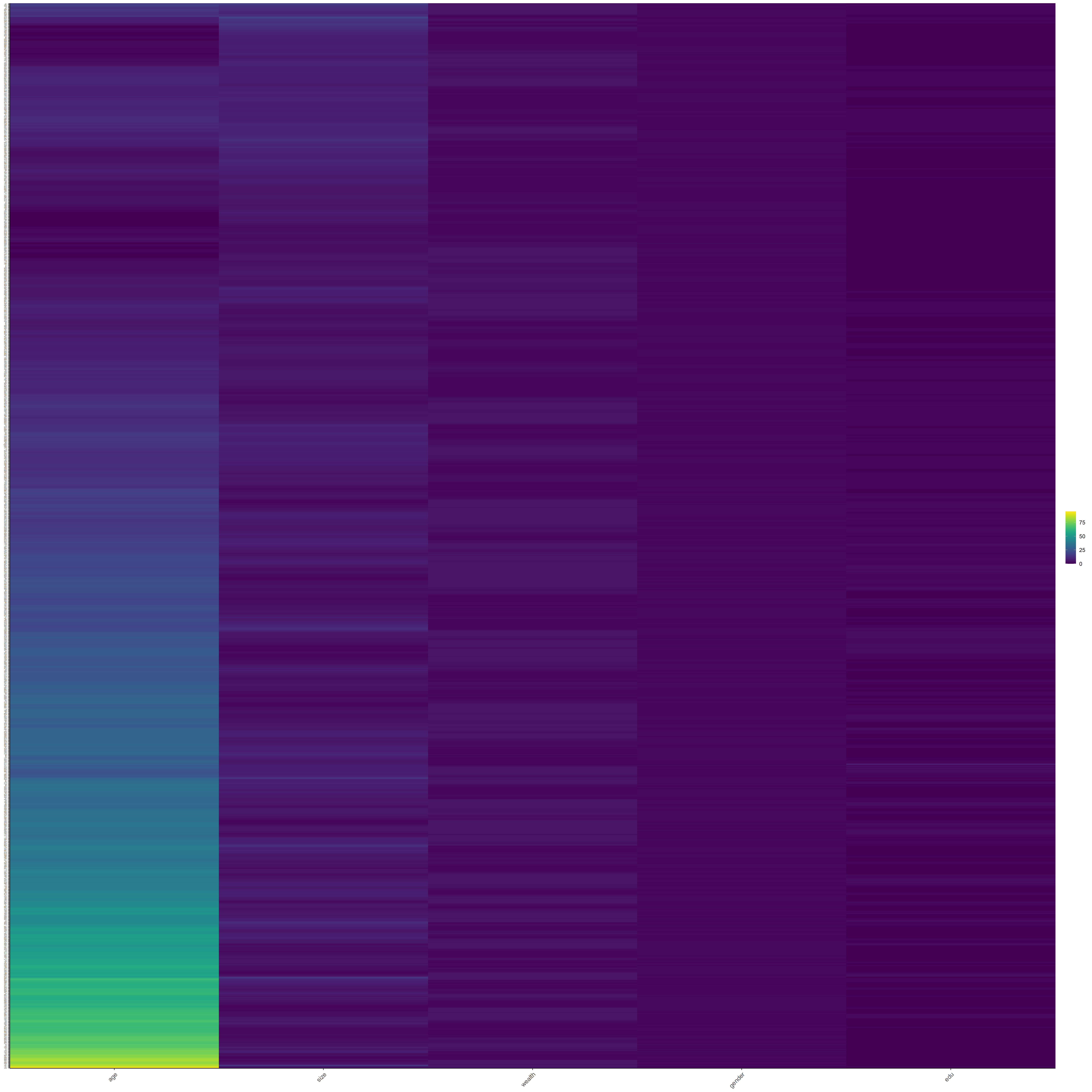
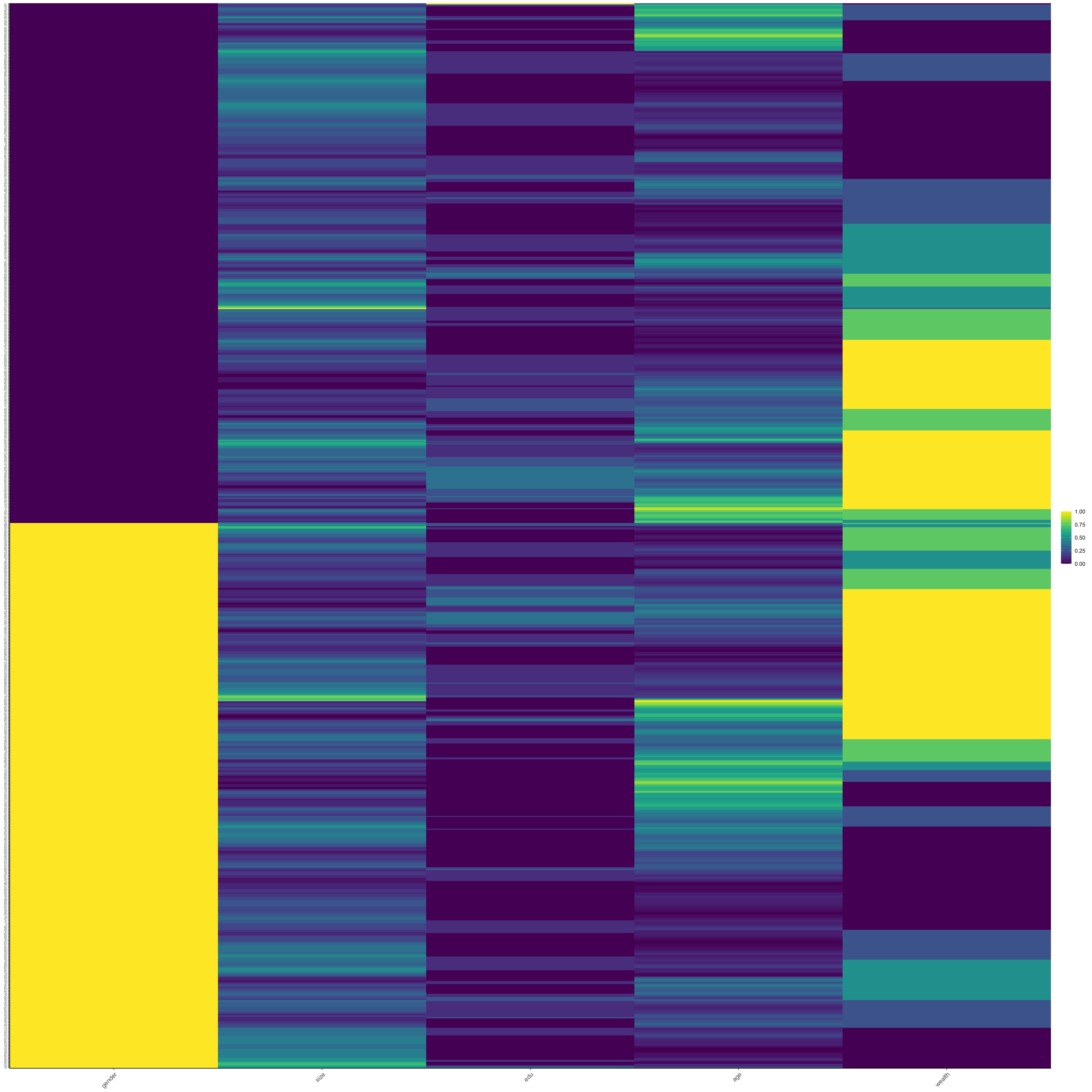
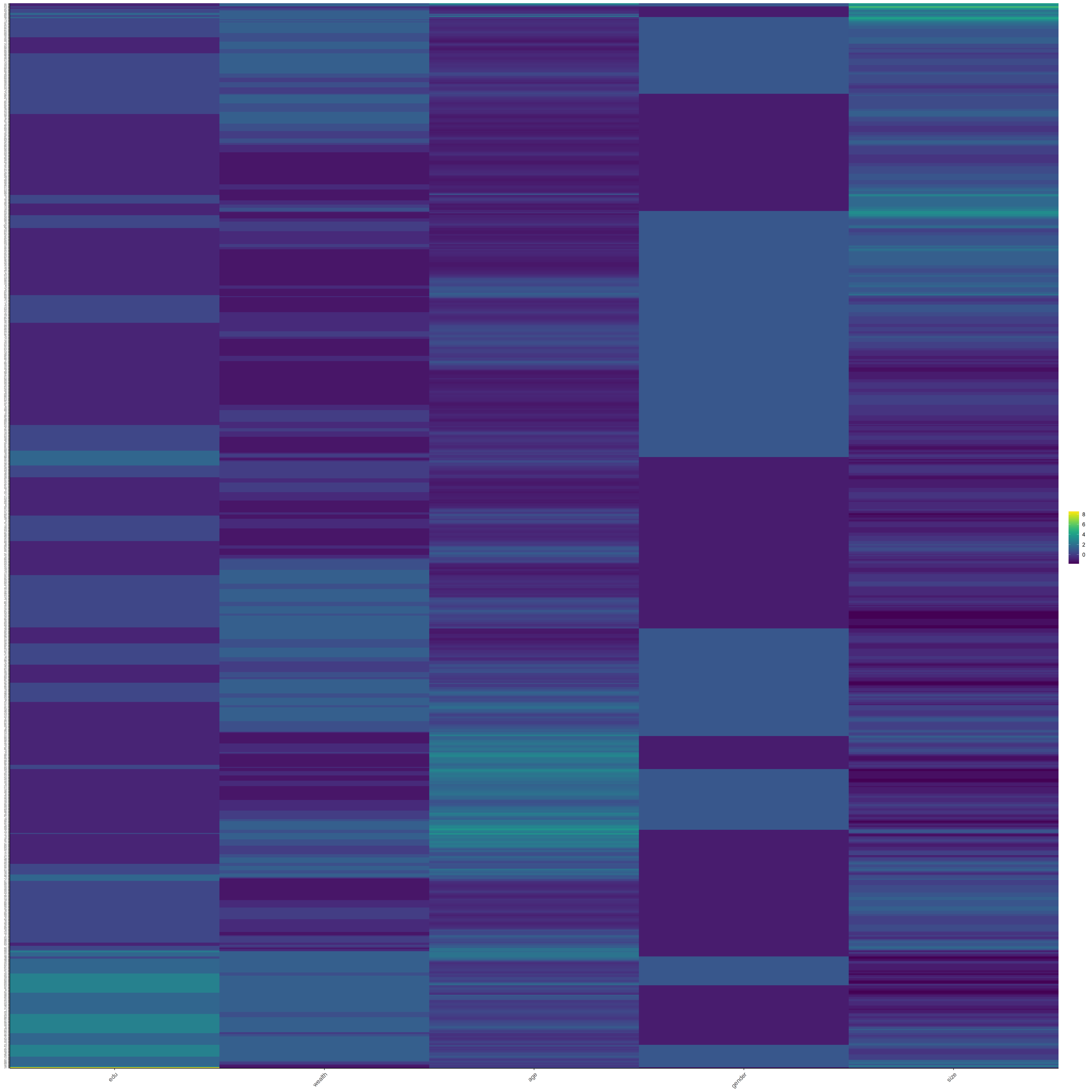
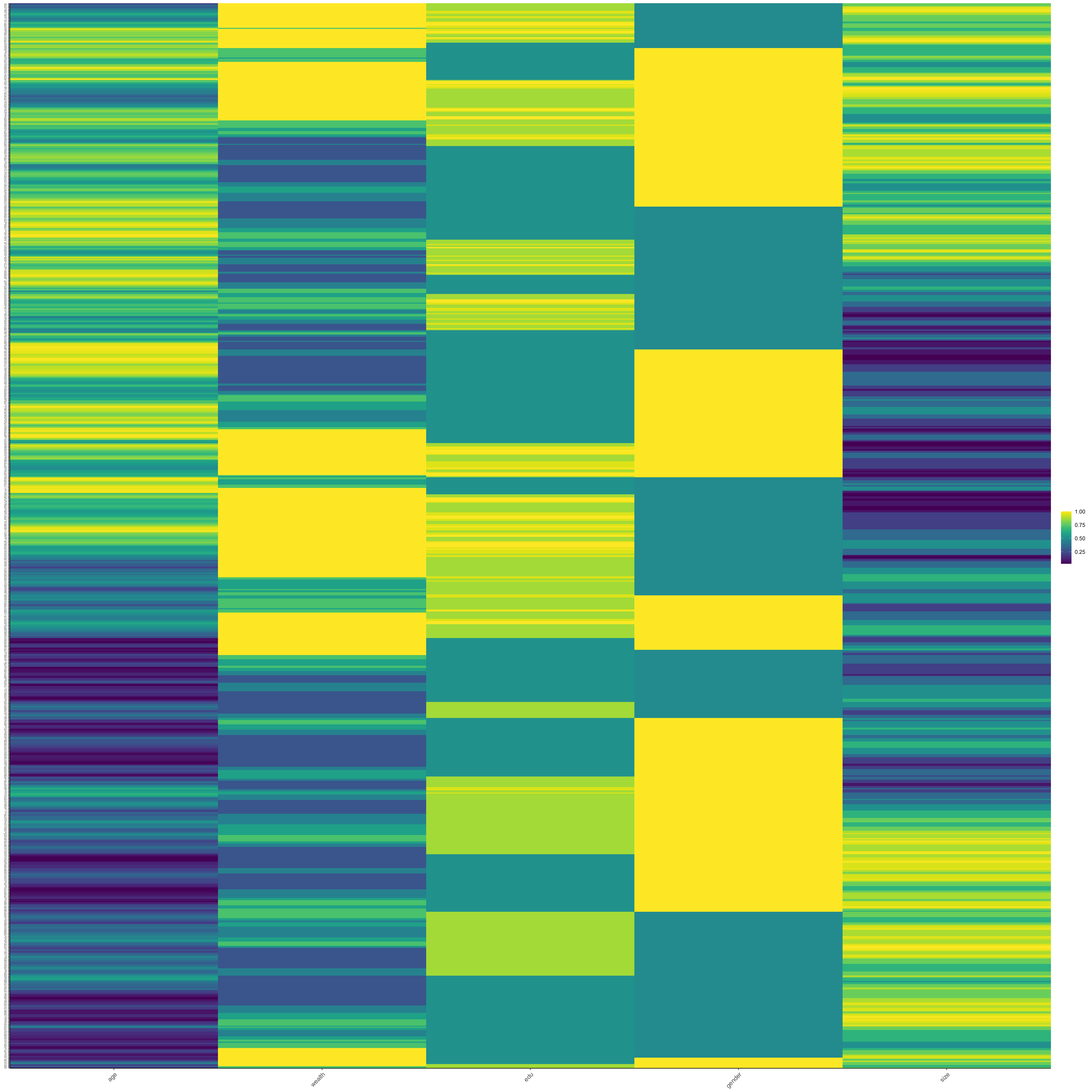
There are approximately 75,000 people sampled in this dataset. I have included the following plots to get a better sense of the wealth distribution among the sample. The first plot (below) shows how many people are in each of the five wealth categories. I included heat maps to describe the data after my analysis due to their size.
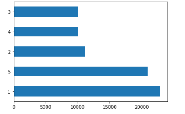
For the next five plots, I plotted only one wealth category population against all the others. The first plot is the least wealthy group (1) versus all the others.
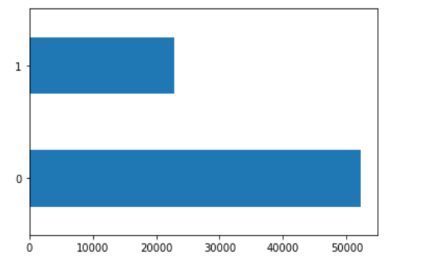
The second plot is the second least wealthy group (2) versus all others.
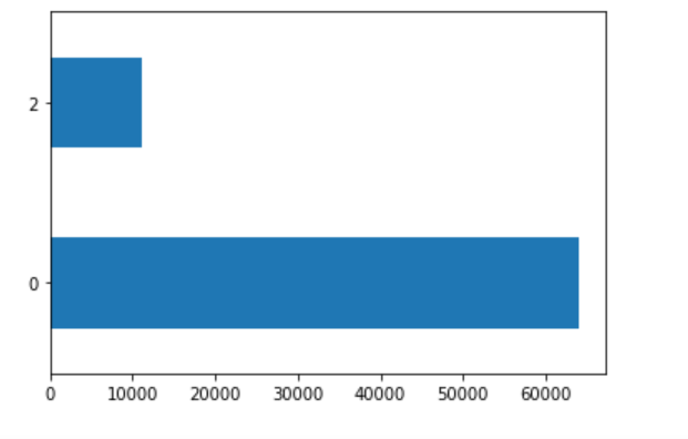
The third plot is the middle group (3) versus all others.
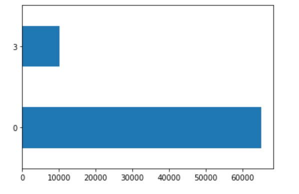
The fourth plot is the second most wealthy group (4) versus all others.
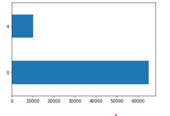
The fifth plot is the most wealthy group (5) versus all others.
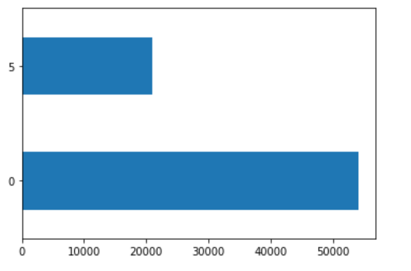
The largest wealth categories, based on population, are the least wealthy (1) and most wealthy (5).
Task #1: Using the R script provided, split and sample your DHS persons data and evaluate the AUC - ROC values you produce.
Which “top_model” performed the best (had the largest AUC)? Are you able to use the feature selection penalty to tune your hyperparameter and remove any potentially irrelevant predictors?
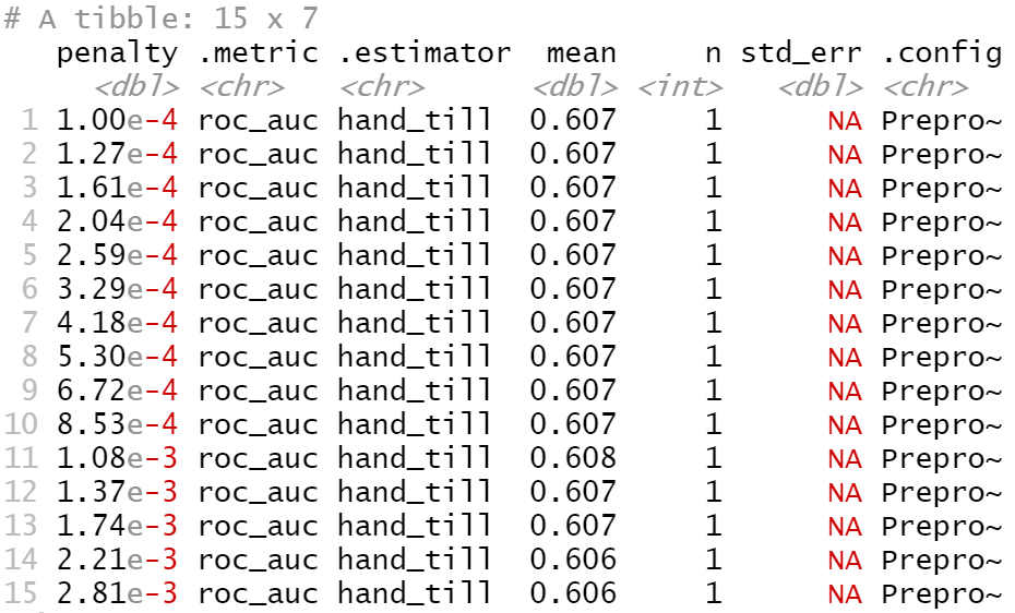
Based on this data alone, it is difficult to select the best performing model because the mean accuracy of several top models is the same. I will plot the models’ AUC-ROC curves to see which is the biggest, and then select that penalty to tune my hyperparameter and remove any potentially irrelevant predictors.
Provide justification for your selected penalty value? Finally, provide your ROC plots and interpret them. How effective is your penalized logistic regression model at predicting each of the five wealth outcomes.
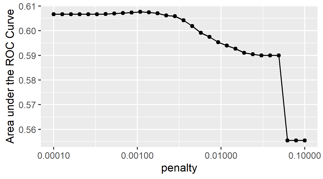
I chose the penalty from the eleventh slice because it has the highest penalty without decreasing model performance. Although the decrease in model performance is not very great for the twelfth through the fourteenth slices, the eleventh slice had the highest area under the ROC curve of all slices, and it is more penalized compared with the previous ten slices, so I will select its penalty. This penalty equals .00108. I think this slice best balances area under the curve and penalty; it has a large area and a decent penalty. The plot below shows how well this slice predicts each of the five wealth outcomes.
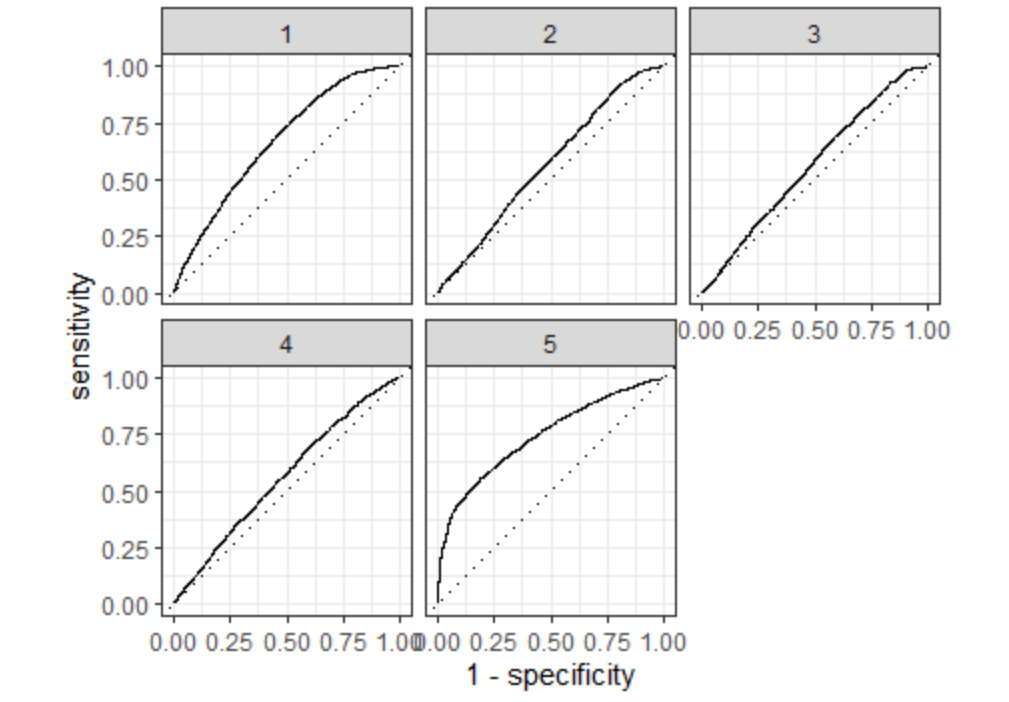
The slice clearly predicts the wealthiest population the best. It also predicts the least wealthy well. It is not as accurate for the middle three groups. With more time, I would like to combine the middle three groups into one large group to see how it would affect the model.
For comparison, I have chosen the twelfth slice, with a penalty of .00137. The twelfth slice has a higher penalty, so it may be better at removing potentially irrelevant predictors. However, there is slightly less area under the ROC curve, so it may not be as good at predicting wealth outcomes.
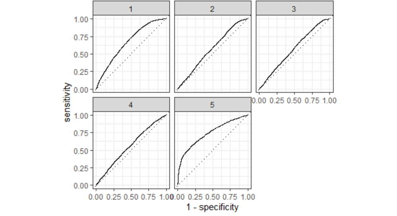
This slice is also best at predicting the wealthiest group and second best at predicting the least wealthy group. It does not appear to be significantly different from the best model, which makes sense because the AUC-ROC and penalty values are very close.
Task #2: Using the R script provided, set up your random forest model and produce the AUC - ROC values for the randomly selected predictors, and the minimal node size, again with wealth as the target.
How did your random forest model fare when compared to the penalized logistic regression? Provide your ROC plots and interpret them. Are you able to provide a plot that supports the relative importance of each feature’s contribution towards the predictive power of your random forest ensemble model?
Below are the metrics for my random forest model. The mean accuracy is slightly better than that of the previous model (penalized logistic regression).
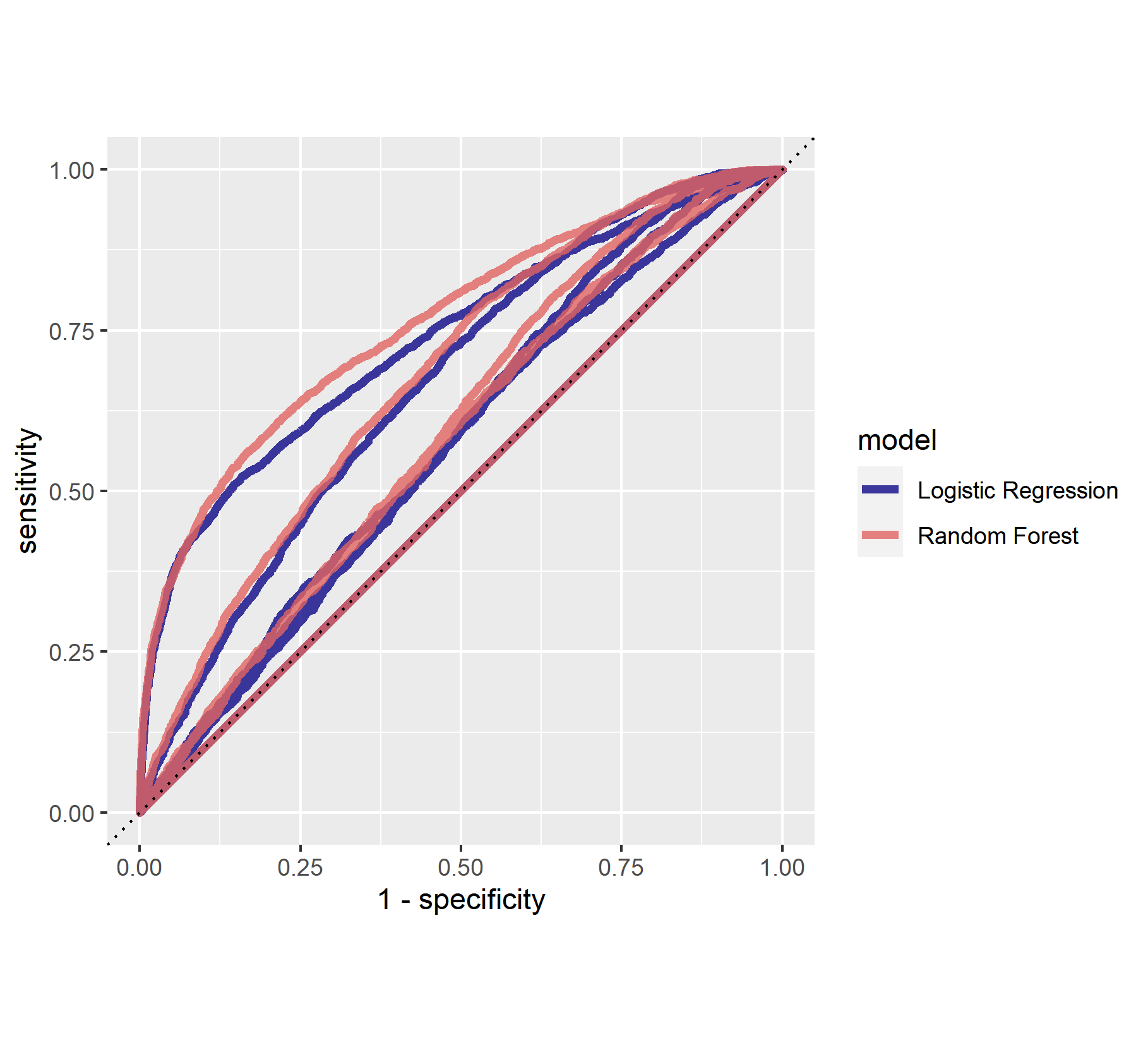
Below are the ROC curves for the random forest model. This model also best predicted wealth category 5, and it did a good job predicting wealth category 1 as well. It seemed that it predicted wealth categories 2, 3, and 4 better than the penalized logistic regression, but in general it would be good to improve its ability to predict these.
Overall, the two models have performed very similarly. However, the random forests model is slightly superior to the penalized logistic regression.
The following plot demonstrates the importance of each feature used to predict wealth. These are age, education, size and gender.
Task #3: Using the python script provided, train a model using the tensorflow estimator API and your DHS data, again with wealth as the target.
Apply the linear classifier to the feature columns and determine the accuracy, AUC and other evaluative metrics towards each of the different wealth outcomes.
Then continue with your linear classifier adding the derived feature columns you have selected in order to extend capturing combinations of correlations (instead of learning on single model weights for each outcome).
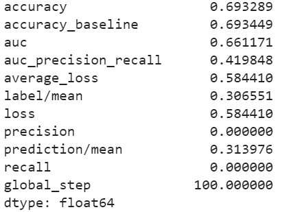
I first trained the linear estimation model to predict the least wealthy category (1) versus all the other wealth categories. The following plots shows the evaluation metrics, probability frequency plot, and ROC curve for this model. The model accuracy is almost 70%, and the ROC curve shows that the model does a good job of predicting a wealth category equal to one versus the other categories.
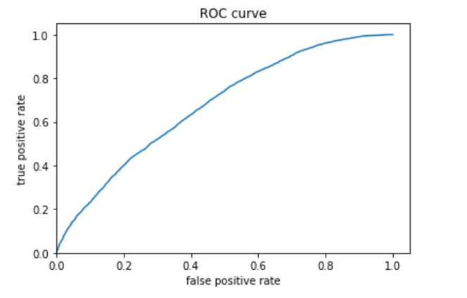
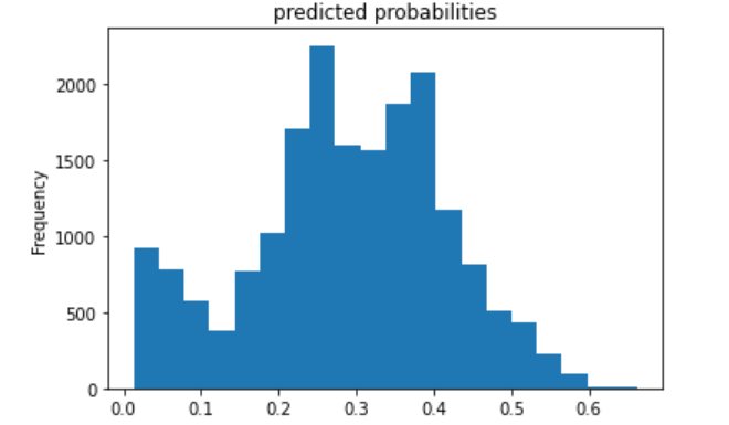
I then trained models to predict each wealth category. The ROC curves and predicted probablity plots of the model for each wealth category are all below, in order of wealth category. I examined evaluation metrics for each wealth category as well but only included metrics for models predicting categories 1 and 5 because the other categories did not perform as well in any of the models. I will compare these evaluation metrics to those of the other models in my final analysis. The first model is for category 1, the least wealthy category; these plots are above. The plots for categories 2 through 5 are below.
The second (below) is category 2.
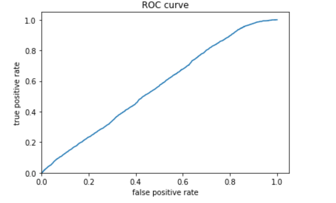
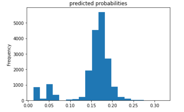
The third (below) is category 3.
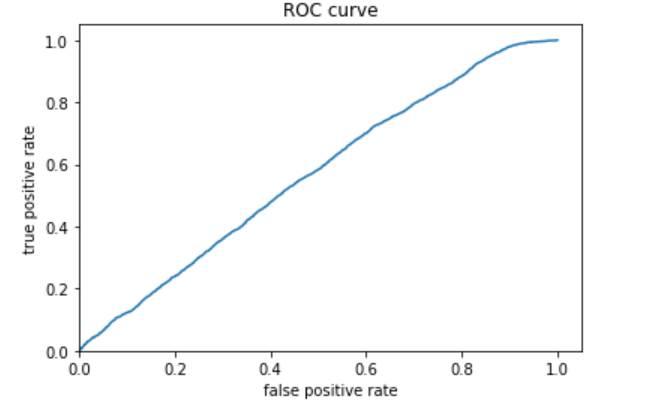
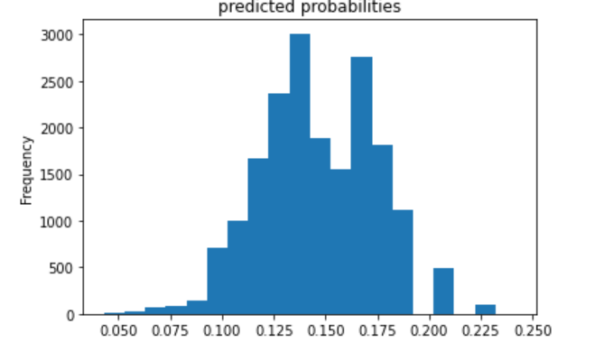
The fourth (below) is category 4.
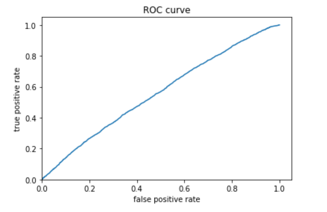
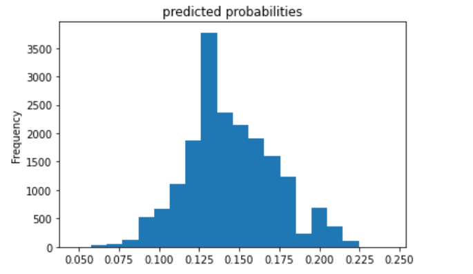
The fifth (below) is category 5.
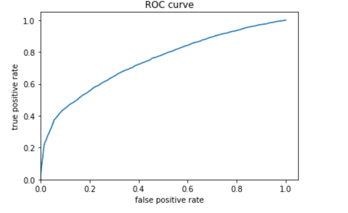
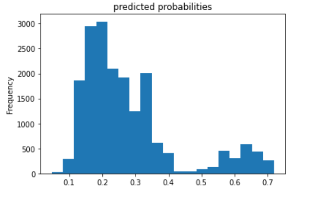
I decided to also include the evaluation metrics for category 5 because the ROC curve showed that the model was probably best at predicting this category. The AUC is fairly high, even compared with the model for category 1.
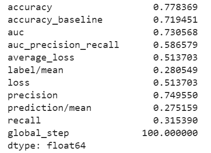
The model performs best for the 1st and 5th wealth categories (the least and most wealthy).
I decided to train another model to predict a wealth category of 1, adding a derived feature column crossing size and education. However, there was no significant difference between this and the previous model, so I decided to add a derived feature column crossing gender and education. There was no significant difference between this model and the two previous. The ROC curve and area under the curve looked nearly exactly the same as for the first model I created for category 1, so I decided it was not worthwhile to include the graphics in this writeup.
Task 4: Using the python script provided, train a gradient boosting model using decision trees with the tensorflow estimator.
Provide evaluative metrics including a measure of accuracy and AUC. Produce the predicted probabilities plot as well as the ROC curve for each wealth outcome and interpret these results.
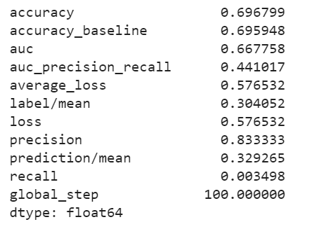
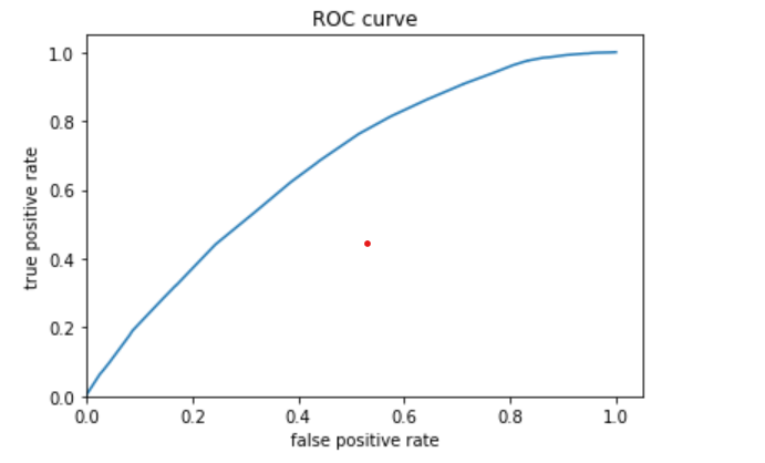
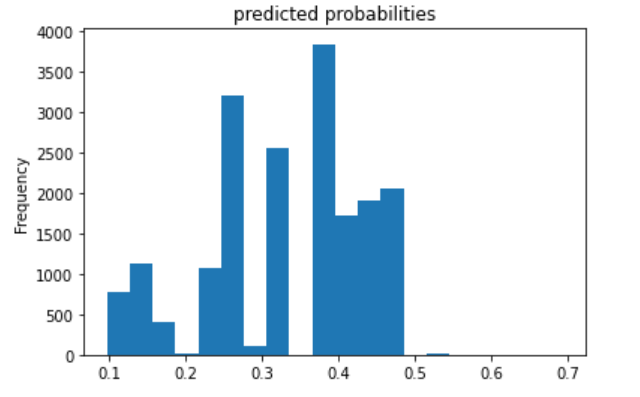
I trained models to predict each wealth category. The ROC curves and predicted probablity plots of the model for each wealth category are all below, in order of wealth category. The first model is for category 1, the least wealthy category; these plots are above. The plots for categories 2 through 5 are below.
The second (below) is category 2.
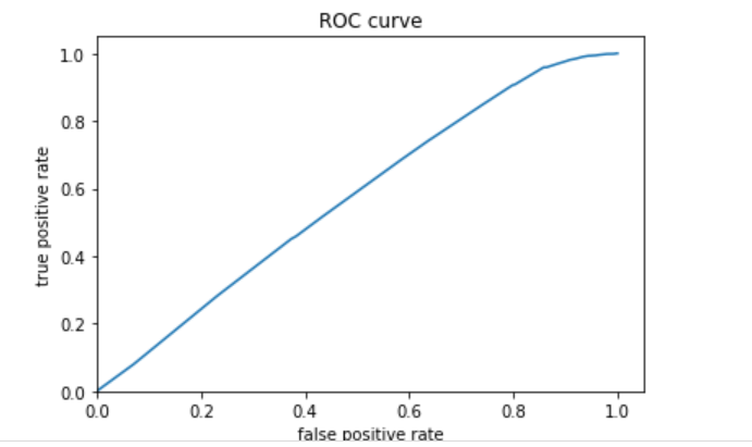
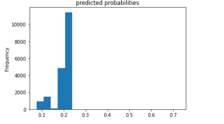
The third (below) is category 3.
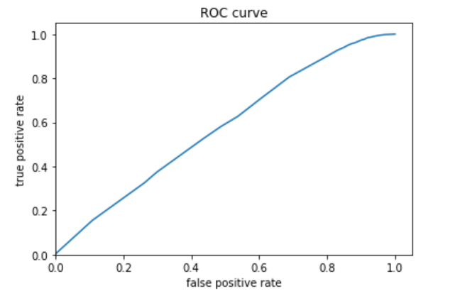
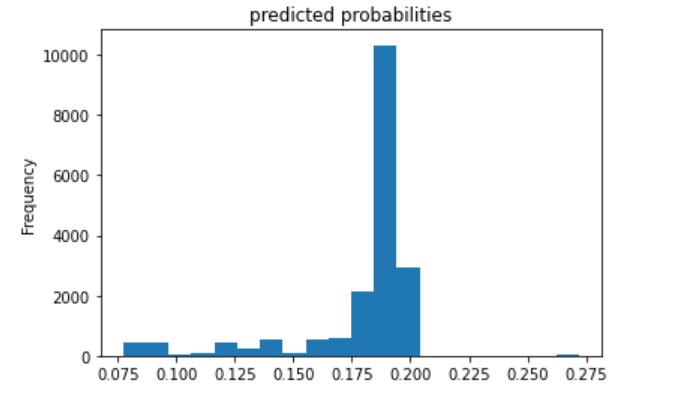
The fourth (below) is category 4.
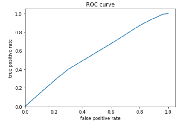
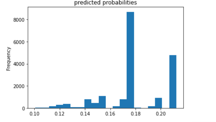
The fifth (below) is category 5.
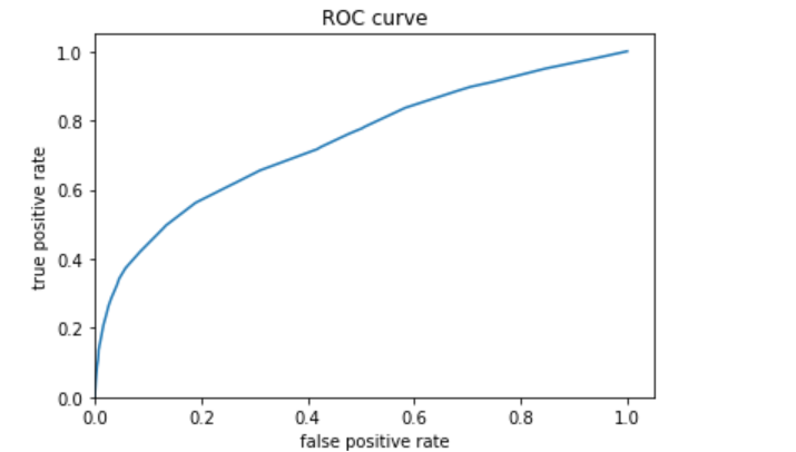
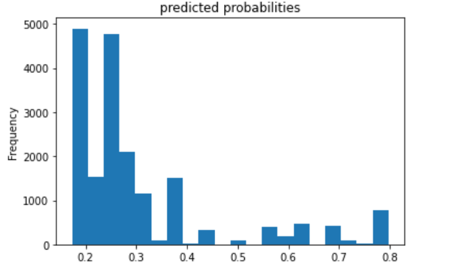
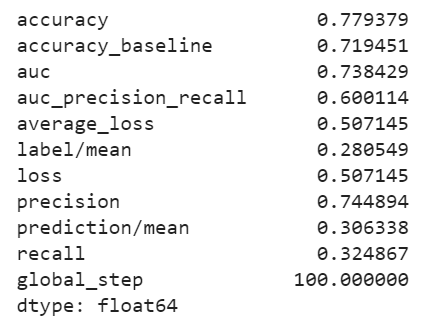
I decided to also plot the evaluation metrics for category 5 because this model best predicted this category.
Analyze all four models. According to the evaluation metrics, which model produced the best results? Were there any discrepancies among the five wealth outcomes from your DHS survey dataset?
All four models performed best at classifying wealth categories of 1 and 5, the least and most wealthy. Perhaps this is partly because these categories have a larger population than the mid-range wealth categories 2, 3, and 4.
Based on area under the curve, the linear estimation and gradient boosting model performed the best. There appeared to be little differences between the two. They both performed well at predicting wealth category 1, and they were best at predicting wealth category 5. The AUC values for the linear estimation model were .661 for wealth category 1 and .731 for wealth category 5. The AUC values for the gradient boosting model were .668 for category 1 and .738 for category 5. Thus, I conclude that the gradient boosting model was the best of the four, although not by much more than the linear estimation model.
In comparsion, the penalized logistic regression model exhibited an AUC of nearly .61, and the random forest model exhibited an AUC of about .62. These AUCs are not nearly as high as the other models; however, it seems that these two are similar to each other. They also performed better at predicting the 1st and 5th wealth categories.
Below are four heat maps which describe the data.
